VYZO | Startup Landing Page Design | Medical Wait time tracking System
Vyzo streamlines doctor appointments with a smart wait-time management system, allowing patients to book tokens and estimate consultation times. The landing page introduces Vyzo’s core features with a clean, intuitive design to drive early adoption.

01
Problem Statement
Patients often face long, uncertain wait times at clinics, leading to frustration and inefficiency. Doctors struggle with managing patient flow, resulting in overcrowding and inconsistent schedules. Traditional appointment systems lack real-time adaptability, making the process inconvenient for both parties.
02
Solution
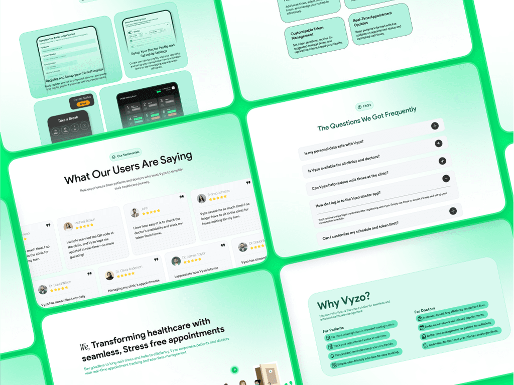
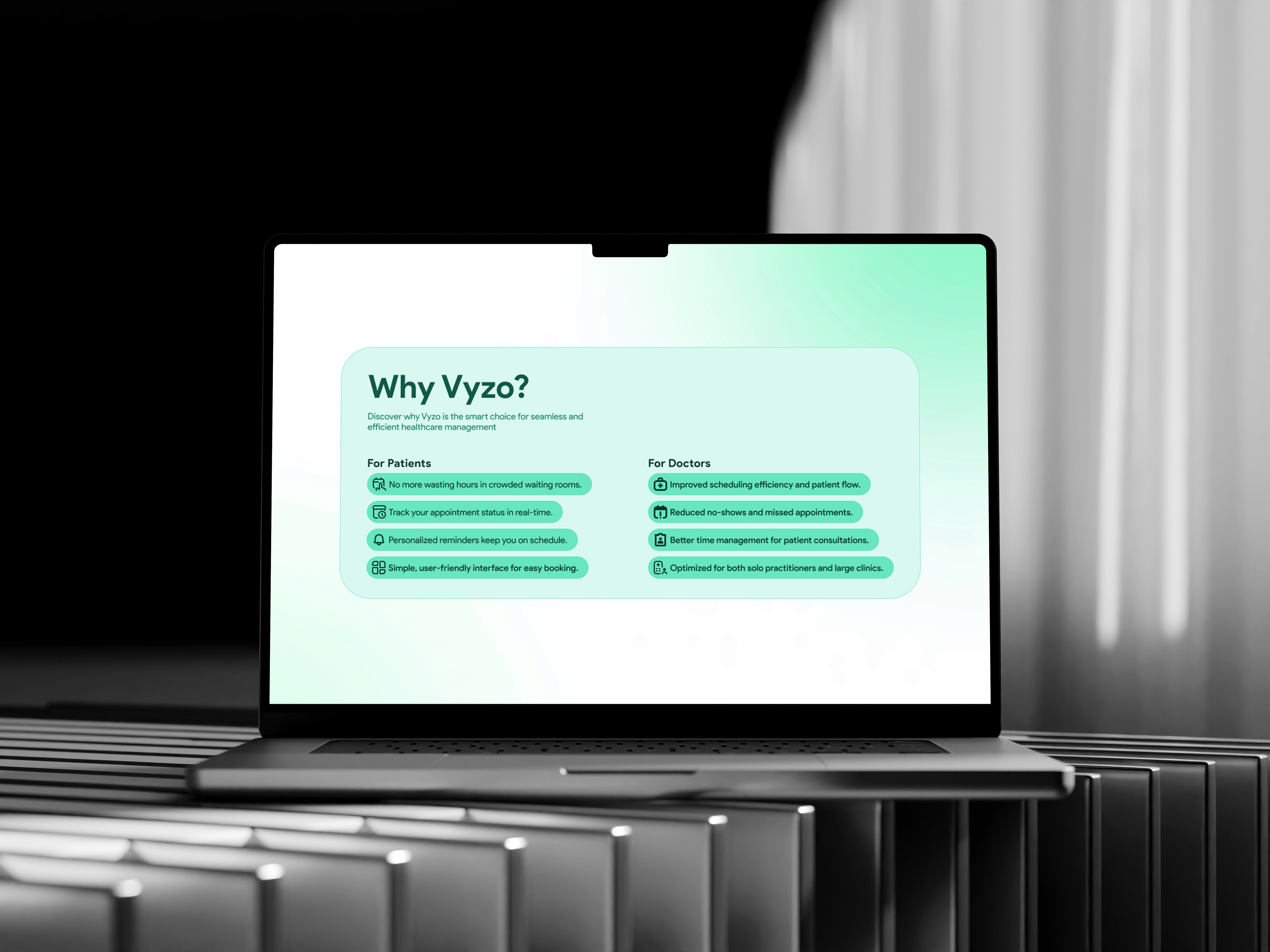
Vyzo introduces an appointment system that optimizes wait-time management. The landing page is designed to communicate Vyzo’s value proposition clearly, ensuring seamless onboarding for users. With a user-centric interface, it simplifies patient bookings, enhances doctor efficiency, and builds trust in the early adoption phase.

03
Design Approach
Clarity & Simplicity: A minimal, intuitive layout that quickly conveys Vyzo’s purpose.
User Trust: testimonials, doctor endorsements, and a seamless booking preview.
Conversion Focused: Clear CTAs guiding users to explore and sign up effortlessly.
Vyzo’s landing page combines clarity, trust, and conversion-focused design to attract doctors. A clean, professional layout reinforces credibility, while concise messaging highlights the efficiency of Vyzo’s system. Visual hierarchy and intuitive navigation address pain points, guiding doctors seamlessly. Strategic CTAs, engaging microinteractions, and social proof build trust and drive sign-ups. This UX-driven approach ensures successful early adoption and long-term retention.
04
Result
The landing page plays a crucial role in Vyzo’s launch, helping attract early adopters, validate the concept, and establish credibility in the healthcare industry.